Skip to content
← ALL WORK
( CASE STUDY )03 — PHOTOGRAPHY & CREATIVE PRACTICE

Aperture

A portfolio that behaves like an exhibition.

Aperture asks what a photographer’s website becomes when the work is given room instead of a grid. The concept treats the site as a sequence of rooms—each chapter with its own light and tempo—so that browsing feels closer to walking an exhibition than scanning thumbnails.

INDEPENDENT CONCEPTView live concept ↗

( WHY WE BUILT THIS )

Creative-sector briefs often begin with the assumption that more work on screen means more persuasion. We built Aperture to test the opposite: a photography site paced like an exhibition rather than presented as a dense grid.

Independent concept project. The photographer, studio, client stories, and contact details are illustrative and were created to demonstrate Vanto’s approach.

PROJECTIndependent concept
ROLEArt direction, UX/UI & development
TYPEPhotography practice
STATUSLive concept
Aperture photographic exhibition homepage
aperture-gules-one.vercel.app

( AT A GLANCE )

Chaptered
EXHIBITION ARCHITECTURE
Cinematic
SCROLL AND ENTRY PACING
Editorial
TYPOGRAPHIC SYSTEM
Considered
ENQUIRY JOURNEY
01 — THE PREMISE

Give the photograph the whole room.

Most photography sites open with a grid, which asks the visitor to evaluate before they have felt anything. Aperture opens with a single frame at full bleed and a line of type over it, then invites the visitor to walk in. The entry sequence—a deliberate load, a slow reveal—sets a tempo that the rest of the site keeps, so the work is met at the pace it was made.
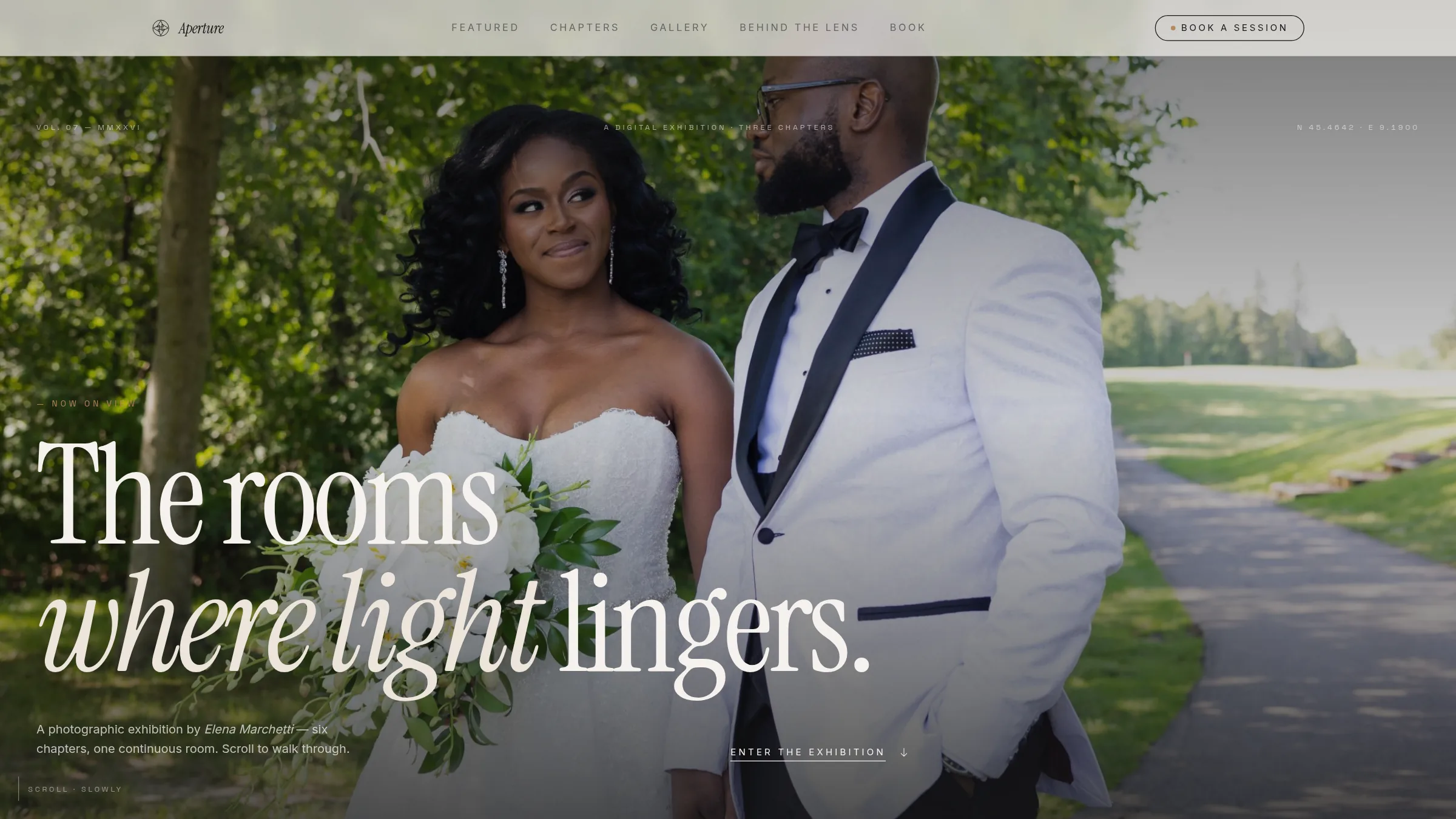
Aperture homepage with a full-bleed photograph and editorial headline
02 — THE STRUCTURE

Three chapters, each with its own light.

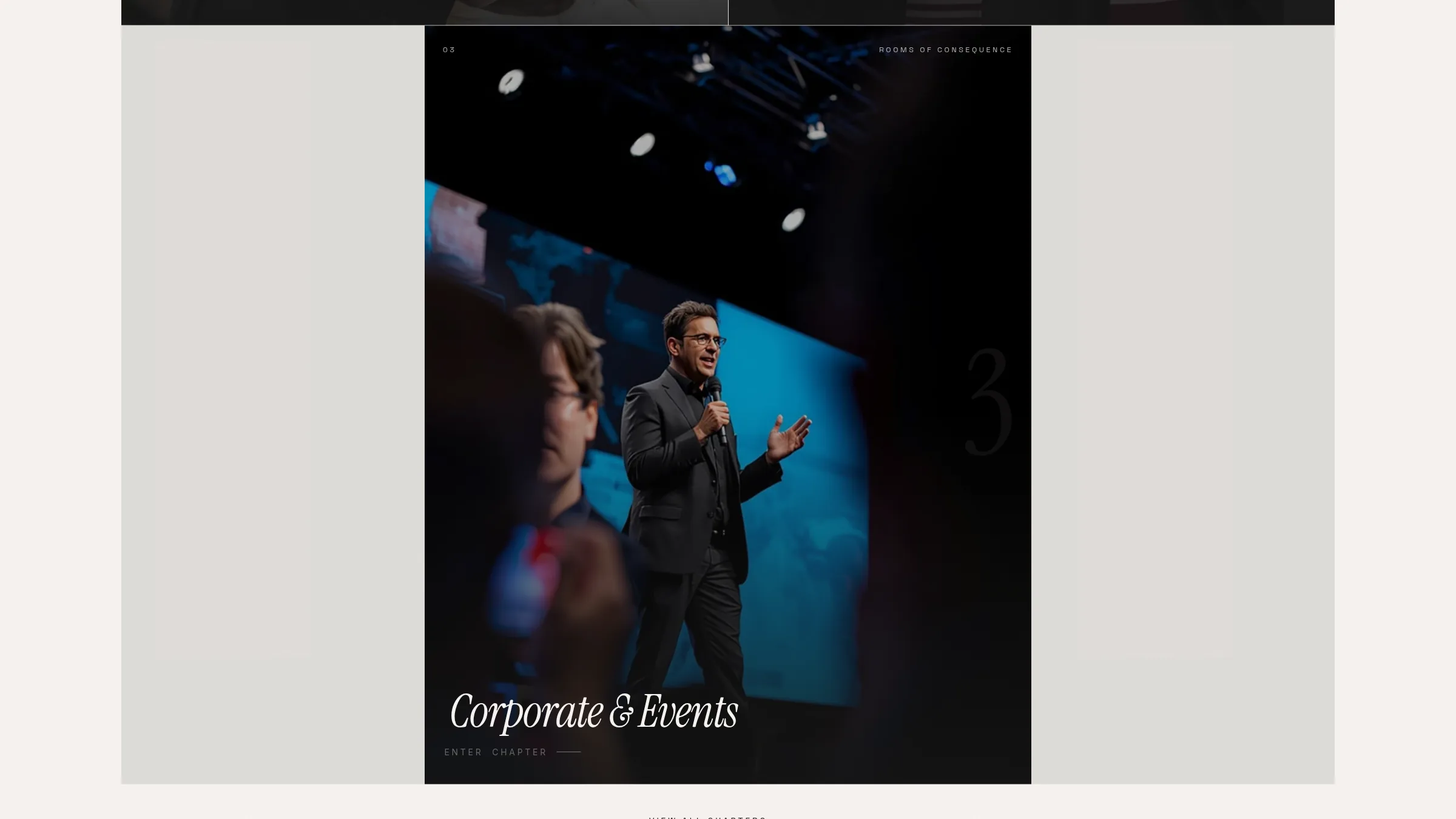
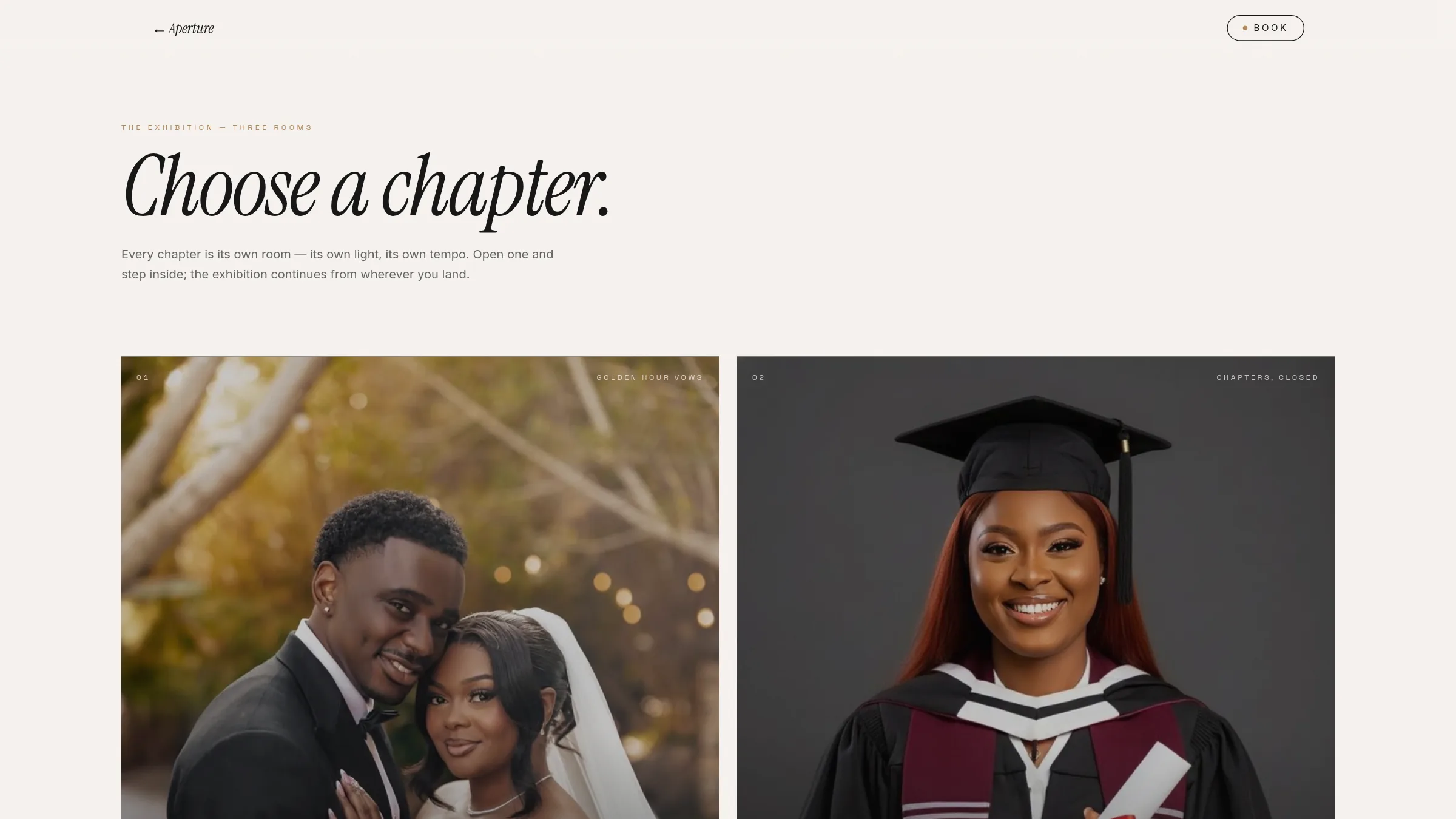
Weddings, graduations, and corporate work are treated as separate rooms rather than filter states on one gallery. Each chapter carries its own palette, pacing, and framing language, which lets very different commissions sit in one practice without flattening into a single mood. The chooser is a threshold, not a menu—visitors step in and the exhibition continues from wherever they land.

Aperture chapter selection screen showing three exhibition rooms
03 — INSIDE A CHAPTER

Editorial typography holding cinematic imagery.

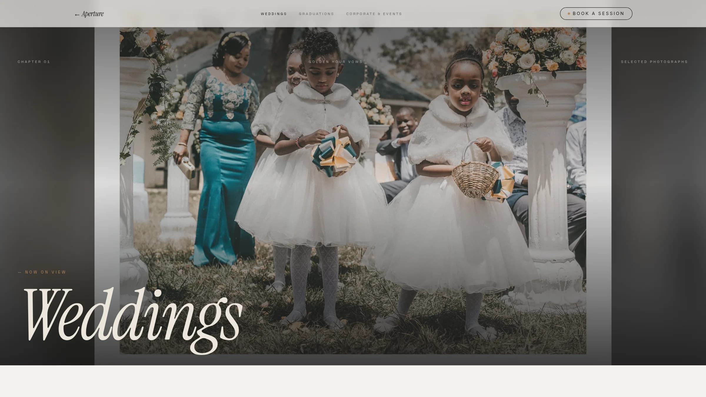
Inside each room, oversized serif titles overlap the photography while monospace captions carry the quiet metadata—location, camera, year, aperture and shutter. The tension between the two registers is the identity: the display type gives the work presence, the technical notes give it credibility, and neither competes with the frame itself.

Aperture weddings chapter with an oversized serif title over a photograph
04 — THE ENQUIRY

A booking flow written as a letter, not a form.

The practice takes a small number of commissions a year, so the enquiry is paced to match. Rather than one long form, it moves through short movements—chapter, where and when, vision, you—phrased as questions a photographer would actually ask. A rotating gallery edit sits above it, so the last thing a visitor sees before enquiring is the work, not a field label.

Aperture gallery grid mixing wedding, graduation, and event photographs

( WHAT IT DEMONSTRATES )

A six-chapter exhibition site with its own entry sequence, per-chapter art direction, and a paced enquiry flow. It answered a question that keeps coming up in creative-sector briefs: whether sequence and restraint can hold attention better than a dense grid—and on this evidence, they can.