Skip to content
← ALL WORK
( CASE STUDY )05 — RETAIL & LIFESTYLE

Little Paws

A nursery that feels as careful as the home behind it.

Little Paws explores a trust-sensitive buying journey: prospective owners want to understand the animals, their care, and the people raising them before beginning a conversation. The concept turns that emotional decision into a calm, transparent digital experience.

INDEPENDENT CONCEPTView live concept ↗

( WHY WE BUILT THIS )

We wanted to test whether a catalogue could stay warm. Most inventory interfaces flatten into filters and grids, which works for parts and feels wrong for something people choose with their families. A puppy nursery gave us the clearest version of that problem to design end to end.

Independent concept project. The brand narrative and business details are illustrative and were created to demonstrate Vanto’s strategy, design, and development approach.

PROJECTIndependent concept
ROLEBrand direction, design & build
TYPEBrand and catalogue website
FOCUSTrust-led enquiry journey
Little Paws premium puppy nursery homepage
littlepawske.vercel.app

( AT A GLANCE )

Multi-page
BRAND EXPERIENCE
Catalogue
BROWSABLE NURSERY
Editorial
CARE AND STORYTELLING
Responsive
MOBILE-FIRST JOURNEY
01 — THE OPPORTUNITY

Make care visible before asking someone to enquire.

A social profile can show charming photographs, but it struggles to explain a considered care philosophy, organize current availability, or answer recurring questions in a calm sequence. The concept begins with a simple strategic idea: the experience should feel closer to visiting a thoughtful home nursery than scrolling through a classified listing.
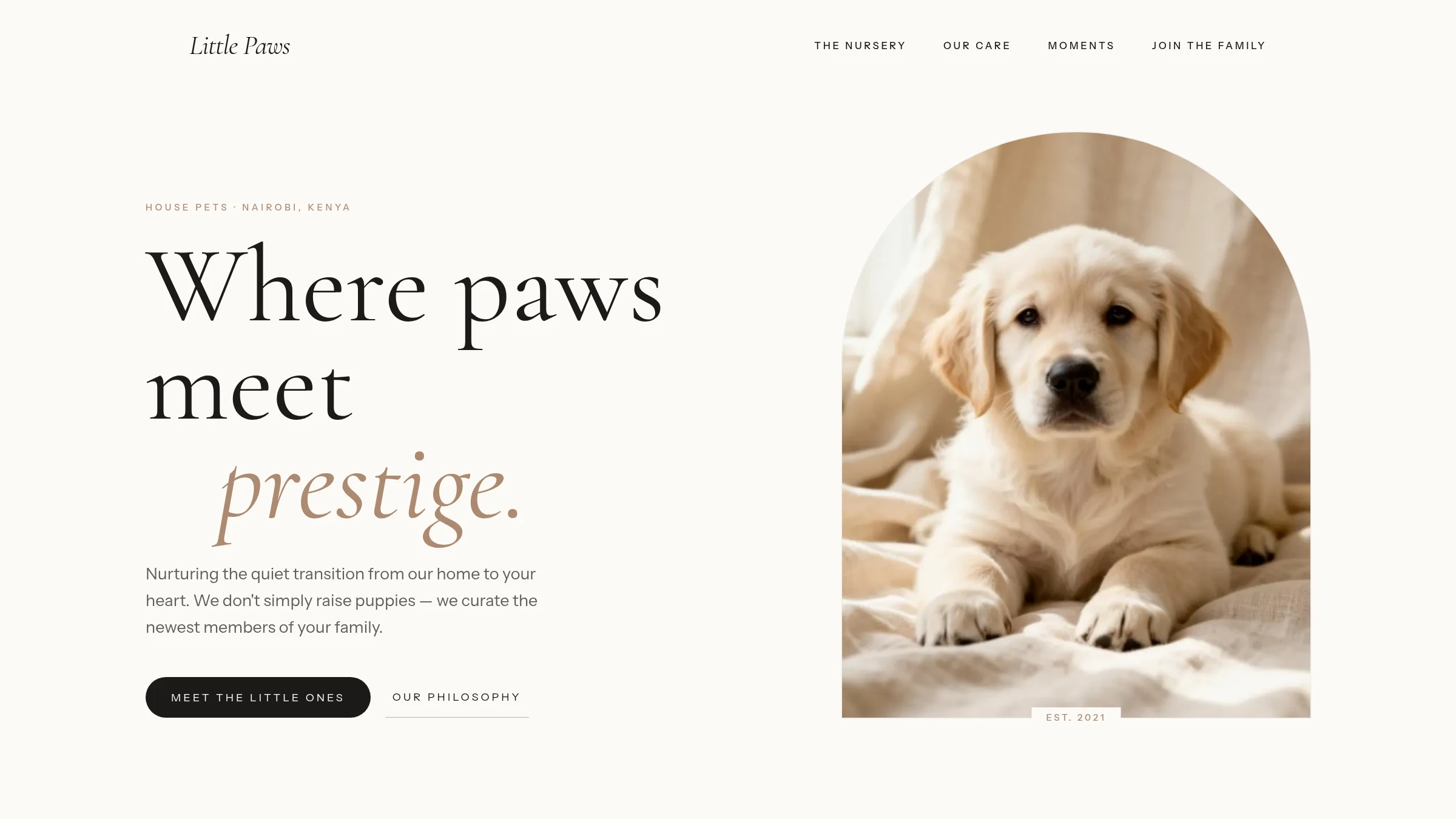
Little Paws homepage with editorial typography and puppy portrait
02 — THE VISUAL DIRECTION

Warmth without becoming childish.

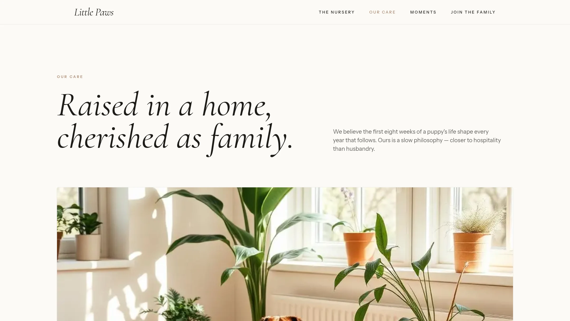
Soft neutrals, generous spacing, portrait-led imagery, and expressive serif typography create an intimate editorial tone. Small uppercase labels and restrained controls provide structure without making the site feel clinical. The design avoids predictable pet-store graphics and instead frames companionship, temperament, and early care as the centre of the brand.

Little Paws care page with quiet editorial layout
03 — THE EXPERIENCE

Browse first, understand more, then begin a conversation.

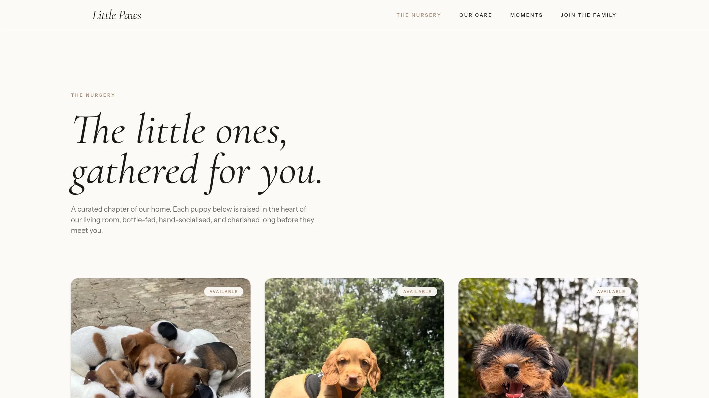
The Nursery presents available puppies as considered profiles rather than products in a dense grid. Supporting pages explain the care approach and collect everyday moments into a visual library. Together, those layers let a visitor move from emotional interest to practical understanding before reaching the enquiry step.

Little Paws browsable nursery showing available puppies
04 — THE ENQUIRY JOURNEY

A gentle conversion point that matches the decision.

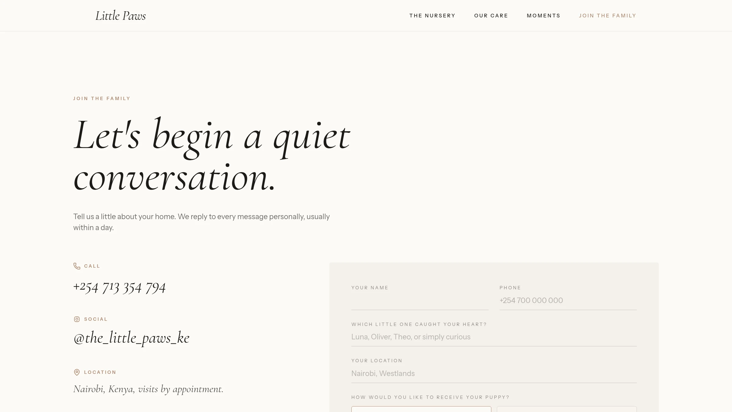
The final interaction is intentionally framed as joining a family rather than completing a transaction. Clear contact routes and a focused enquiry page keep the next step visible without pressuring the visitor. Responsive layouts preserve the editorial character on smaller screens, where discovery and first contact are most likely to happen.

Little Paws join the family enquiry page

( WHAT IT DEMONSTRATES )

A working brand and catalogue experience—nursery listings, care philosophy, and an enquiry flow paced for a decision people make with their families. It proved that a browsable inventory can stay warm rather than transactional when the writing and the interface are designed as one thing.